GeoGebra Tutorial 23 – Spreadsheet, Barchart and Histogram
Note: Although this is the 23rd of the GeoGebra Tutorial Series, just like other GeoGebra tutorials, it is independent from others. This means that you can follow this tutorial step-by-step, without needing to learn the previous twenty two tutorials.
In this tutorial, we are going to use the spreadsheet to perform basic data representation. We will plot a frequency table of grouped data and perform basic computations using the spreadsheet window. After the data is completed, we will construct a histogram.
Problem: Mr. Pi gave 50-item exam to his class. He has 45 students. The scores and frequencies of the grouped data is shown below. Use GeoGebra to create a histogram.
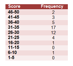
Figure 2
If you want to follow this tutorial step-by-step, you can open the GeoGebra window in your browser by clicking here. You can view the output of this tutorial here.
Step-by-Step Instructions
| 1. Open GeoGebra. | |
| 2. We will need the Algebra window, the Spreadsheet view and the Axes so be sure that they are displayed. If not, use the View menu from the menu bar to show them. | |
| 3. Type the following texts in their respective addresses: From in cell A1, To in cell B1, Frequency in cell C1, Group Average in cell D1 and Product in cell E1. | |
4. We now fill in the From and To column. First, type 1 in cell A2 and type 5 in cell B2. To fill column A, we add the number in cell A2 to 5. To do this, type = A2 + 5 in cell A3. Now, select cell A3 and drag the small square at the bottom-right of the cell pointer (blue rectangle) to cell A11 as shown in Figure 3. Notice that the numbers form an arithmetic sequence.
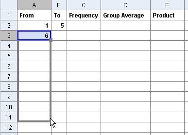 Figure 3 |
|
| 5. Now, type =B2 + 5 in cell B3 and copy it to cell B11. | |
6. Now, encode the frequencies as shown in Figure 4.
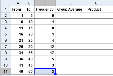 Figure 4 |
|
| 7. To get the group average, of 1 and 5 in cells A2 and B2, type = (A2 + B2)/2 in cell D2 and press the ENTER key. The number 3 should appear in cell D2. Then copy D2 all the way down to D11. | |
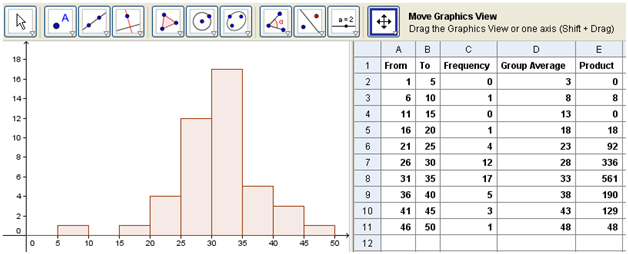
8. To get the product, we multiply the Group Average by the Frequency. To multiply C2 and D2, type = C2*D2 in cell E2. Again, copy cell E2 all the way down to cell E11. Your spreadsheet window should contain all the data shown in Figure 5.
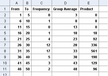 Figure 5 |
|
| 9. We will adjust the numbers shown on the coordinate axes. To do this, select the Move Drawing Pad button and drag the x-axis towards the origin until x = 50 is shown in the drawing pad. Also, drag they y-axis towards the origin such that y=20 is shown. This is because the range of our score 1 through 50 and the range of our frequency is 0 through 20.
Note: If you have updated your version of GeoGebra, the Move Drawing Pad was changed to Move Graphics View. |
|
| 10. Now, we will adjust the interval of the axes. To do this, right click the drawing pad, then click Graphics View.
Note: If you have note updated your version of GeoGebra, you will see Drawing Pad in the context menu instead of Graphics View. |
|
11. In the Graphics View dialog box (Figure 6), select the Axes tab, and within the said tab, select the xAxistab. Check the Distance check box, then change the distance to 5. Now, select the yAxis tab and change the distance to 2.
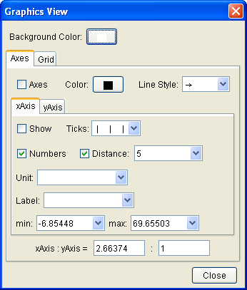 Figure 6 |
|
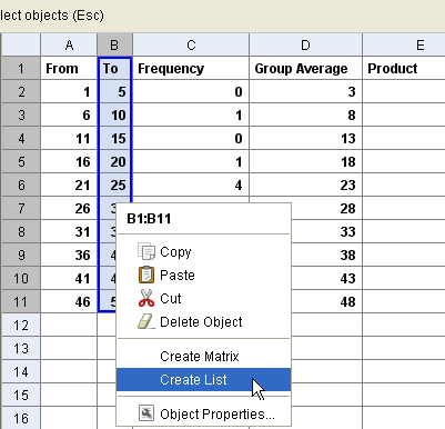
| 12. We are now ready to create our histogram. To create a histogram, we will create lists using the To column and the Frequency column. To create the To column, highlight B1-B11 (Figure 7), right click the selection and choose Create List from the context menu. | |
| 13. Now, create a list for the Frequency column. Highlight C2 to C11, right-click the selection and the select Create List. | |
| 14. We will now edit first list. This is because, we have included cell B1, or the cell containing the text To. We will change the value of cell B1 to 0. To do this, click the View menu and the select Algebra window. | |
15. Double click L1 in the Algebra window. This will reveal the Redefine window. Select B1 and change it to 0.
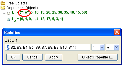 Figure 8 |
|
| 16. To create the histogram, type histogram[L_1,L_2] in the input box and type the ENTER key. Yo16. Try to change the values in the Frequency table. What do you observe?ur drawing should look like Figure 1. | |
| 17. Change the values in the Frequency column. What do you observe? |
You can create the histogram using the Barchart command. Here are the steps to do it:
- Delete L1 and L2 in the Algebra window.
- Construct a new L1 using the Group Averages (cells D2 to D11). Refer to step 12.
- Construct a new L2 using Frequencies (C2 to C11).
- Type Barchart[L_1, L_2] in the Input box and press the ENTER key.
