Storytelling and Statistics at their finest

Statistics is often viewed as a boring subject which is composed of loads of data, graphs, and spreadsheets.  If this is your view of statistics, try seeing the video below (both content and graphics), and see if your view of it is the same after watching the video. The video presents an analysis of health and wealth of 200 countries in  the past 200 years.

The software used on the video is Gapminder, and the presenter is Hans Rosling,is one of the founders of the Gapminder Foundation. The video shows how statistics is applied in the real world. I

GeoGebra Tutorial 20 – Spreadsheet, Slider and Curves of Best Fit

This the 20th tutorial of the GeoGebra Tutorial Series. If this is your first time to use GeoGebra, you might want to read first the GeoGebra Essentials Series.

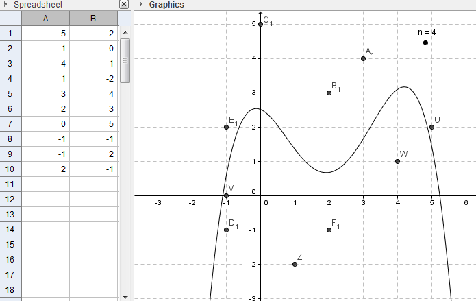
In this tutorial, we use the spreadsheet window to input coordinates of points that will be plotted in the Coordinate plane.  We use the Best Fit Line tool to construct a line of best fit of the plotted points. Finally, we also use the Fitpoly command and the Slider tool to construct polynomial (with varying degrees) curves of best fit.  The output of our tutorial is shown below.

geogebra-spreadsheet-output

You can view the output of this tutorial here.

» Read more