Learning the Mathematics of History through Ngram Viewer
Google Ngram Viewer is an online phrase grapher pioneered by Erez Lieberman Aiden and Jean-Baptiste Michel. It graphs words or phrases from more than 5 million textbooks digitized by Google. The x-axis shows the year while the y-axis shows the percentage of appearance in relation to other n-grams (1-gram is a 1 word phrase, a 2-gram is a 2-word phrase).
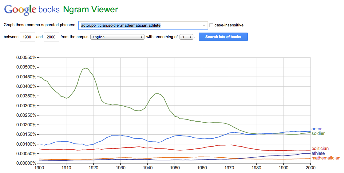
The grapher is easy to use. Just type the words or phrases you want to know about or you want to compare. For example, I want to know which of the following jobs are popular: actor, soldier, politician, athlete, and mathematician. Well, from the result below, if I were a young man who wants to be written in books, I probably wouldn’t want to be a mathematician.
For teachers, these graphs are quite interesting because we can ask students about them. Here are some questions about the graph above. You can can click the image to enlarge the graph.
- Why is being a soldier popular from 1900-1970? Why did its popularity drop?
- What do the peaks in the soldier graph between 1910 and 1920 and between 1940 and 1950 mean?
- Why is it that the actor graph is increasing? Do we expect it to increase in the next 10-20 years? Why?
- Since the 1900s, mathematicians were more popular than athletes. Why a sudden switch in the mid 70’s?
- Why are mathematicians not popular?
Watch the TED Talk videos below to know more about Ngram Viewer (you can also read the about page for more technical details). The first video introduces Ngram Viewer while the second video highlights its use and its connection to mathematics.