Gnuplot Tutorial 1 – Graph Basics
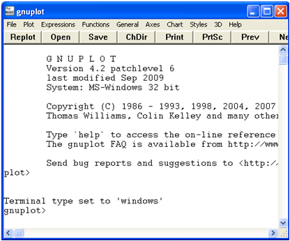
Gnuplot is a command-driven graphing software. It is free and available in Windows, OS2, DOS and Linux. If you are using Windows, then your Gnuplot window would look like Figure 1.

Figure 1 – The GNU Plot window.
The text gnuplot> at the bottom left of your Gnuplot window is called the Gnulot prompt. It is used for typing command just like in the Windows command prompt.
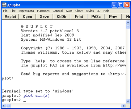
In this tutorial, we are going to plot the graph of the sine function and modify several options of our output. To plot the graph of the sine function, type plot sin(x) in your GNUPlot prompt (see Figure 2) and then press the ENTER key.

Figure 2 – THE GNUPlot window after plotting the graph of the sine function.
Figure 3 shows the graph of the sine function produced by Gnuplot after pressing the ENTER key. Notice that the x and y axes have are hidden and have no labels. The x-axis interval is 5 and the y-axis interval is 0.2. We can also notice that the range of the x-axis displayed on the window are from -10 to 10 and the range of they y-axis displayed is from -1 to 1. We will change these settings one-by-one.

Figure 3 – The graph of the sine function.
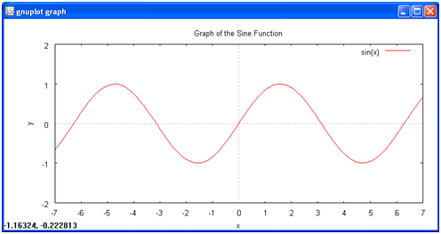
In this plot we are make our graph look like the one shown in Figure 4. Our modifications are the following:
1.) Write a title “Graph of the Sine Function”.
2.) Label the x-axis with “x”
3.) Label the y-axis with “y”
4.) Show the x and the y-axis.
5.) Change the range of the x-axis from -7 to 7.
6.) Change the range of the y-axis from -2 to 2.
7.) Set the interval of the x-axis interval to 1
8.) Set the interval of the y-axis interval to 1.

Figure 4 – Modifed graph of the sine function.
To make the modifications above, just type the commands in the Command column and then press the ENTER key after typing. Remember that after pressing the ENTER key after a command is written, you can always view the changes by typing replot and pressing the ENTER key again.
| Command | Notes |
| 1.) set title “Graph of the Sine Function” | Writes the title Graph of the Sine Function at the top center of the graph. Try typing replot in the GNUPlot prompt and press the ENTER key to see the changes in the graph. |
| 2.) set x label “x” | Labels the x-axis “x” |
| 3.) set ylabel “y” | Labels the y-axis “y” |
| 4.) set zeroaxis | Shows the x and y axis |
| 5.) set xrange [-7:7] | Sets the Cartesian plane x-axis from -7 to 7. |
| 6.) set yrange [-2:2] | Sets the Cartesian plane y-axis from -2 to 2. |
| 7.) set xtics (-7,-6,-5,-4,-3,-2,-1,0,1,2,3,4,5,6,7) | Set the intervals of the x-axis to 1 and label the intervals. We chose from -7 to 7 because this is the range of our x-axis. |
| 8.) set ytics (-2,-1, ,0,1,2) | Set the intervals of the y-axis to 1 and label the intervals. We chose from -2 to 2 because this is the range of our y-axis. |
And we are done. To view your graph, type replot and then press the ENTER key. Your graph should look like Figure 4.
GNUPlot can, of course, plot graphs that are a lot more complicated than what we have done above. It is capable of 3-dimensional graphs such as the one shown below.
We are going to discuss them in the future GNUPlot tutorials, so keep posted.
