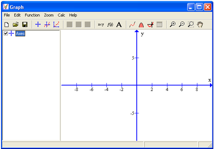
Graph, a graphing software created by Ivan Johansen, was the first graphing software I have learned to use. Although the graphics quality is not that impressive, it has some features that are not available in other graphing software, the most notable of which is the polynomial of best-fit.

Figure 1 – The Graph Window.
The tutorial below teaches the basics of Graph, and most examples are related to elementary and high school mathematics.
The basic capabilities of Graph are enumerated below.
I. Graph Functions
As an example, we will plot the graph of the function f(x) = x2 + 3x from x = -3 to x = 2, the graph of which is shown in Figure 2.
- To graph a our function, just click the Function menu from the menu bar, then click Insert function, then type the equation of your function. The enumerated steps below are associated with the numbers shown in Figure 2.
- Choose Standard from the Function type drop-down list box. The other options are Parametric and Polar.
- Type the equation of our function f(x) = = x^2 + 3x in the Function equation text box. Like other software, Graph uses ^ to denote exponential notation.
- Specify the domain of the function which is from -3 to 2.
- Choose the type of start and endpoint at the Endpoints drop-down list boxes. We choose circle for our left end point and arrow for our right endpoint.
- Change the color, line style, draw type, and width of the graph. Click the OK button when you are done.

Figure 2 – The Function dialog box and the graph of the function f(x) = x2 + 3x.
Exercise: Refer to the steps above in graphing the following functions:
Standard Functions
- f(x) = x^3 + 3x – 1
- f(x) = sin(x)
- f(x) = sqrt(x)
- x(t) = cos(t), y(t) = tan(t)
- e^(sin(t)) – 2cos(4t) + sin((t – pi/2) /12)^5
Note: a, b and c are standard functions; d is parametric and e is polar. Choose their appropriate function type the Function type box before typing the equations.
II. Graph Inequalities
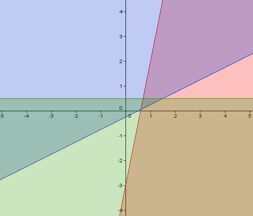
To get the intersection of the graph y < x^3 + 3 and y > 2x, we first transform the inequality to equation, and choose the shaded portion later. This is the part of Graph that I do not quite like. It’s more like manual drawing rather than graphing.
- Click the Function menu from the menu bar, the click Insert Function.
- Type x^3 + 1 in Function equation box.
- To graph y > 2x, repeat step a and type y = 2x in the Function equation box.
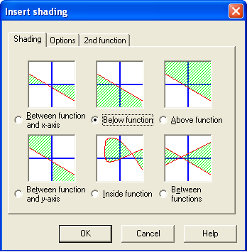
- To shade the graph below x3 + 3, be sure that the equation of the function is selected in the equation window (left pane). Click Function from the menu bar and then click Insert shading… from the list.
- Choose Below function icon (see Figure 3). Take note of the other options. Click the OK button.
- As an exercise, shade y > 2x.

Figure 3 – The Insert Shading dialog box.
III. Plot Points Series and Determine Line (or Polynomial) of Best Fit
To plot a point series, click the Function menu from the menu bar, click Insert point series. Type the ordered pairs on the Insert point series window as shown below.

Figure 4 – The Insert Points series dialog box.
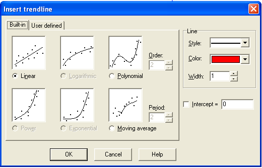
To insert a line of best fit, click the Function menu from the menu bar, then click Insert trendline…. In the Insert trendline window, choose Linear. Notice that you can also choose polynomial of a chosen order fit.

Figure 5 – The Trendline dialog box.
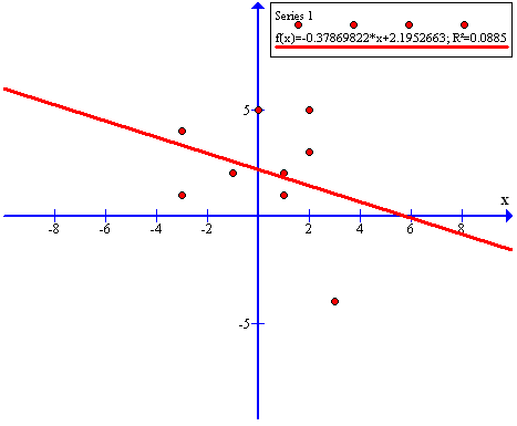
Change the Line width to 3 and click the OK button. The line of best fit of our point series is shown below. The line of best fit graph is shown in Figure 6.

Figure 6 – The Line of Best Fit of the given data in Figure 4.
IV. Find the area under a curve
Graph is capable of finding the area under a curve or technically, perform definite integration. In the example below, we will find the area under the curve of y = sin(x) from -2 to 3.
- To plot y = sin(x), click the Function menu from the menu bar and click Insert function from the drop-down list box.
- Type sin(x) in the Function equation box.
- To get the area of the curve under -2 through 3, click the Calc menu from the menu bar, then click Area from the list.
- A dialog box will appear located at the bottom-left of the Graph window. Type -2 in the From text box and type 3 in the To text box. Notice that the area the curve is displayed on the Area box below the To text box.
V. Generate a table from a graph
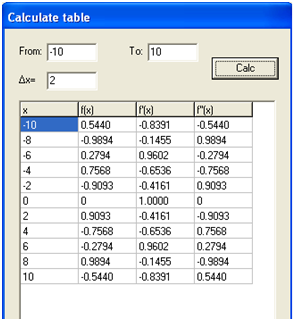
Graph is capable of generating table from a graph. If we want to generate table of values of the graph y = sin(x) in (4), be sure that the graph is selected in the left pane of the Graph window, then do the following steps:
- Click the Calc menu and then click Table.
- Type the minimum value, say -10, in the From text box and the maximum value, say 10, in the To text box.
- In the
 text box, type the interval, say 2, of your table, the click the Calc button.

Notice that not only the x and f(x) are displayed but also the value of the first and second derivatives.
