Geometer’s Sketchpad Tutorial 3: Graphs and Sliders

In this tutorial, we are going to use Geometer’s Sketchpad to explore the graph of the function y = mx + b where m and b are real numbers. First, we are going to type each equation manually, but later, we are going to use sliders to see the relationship between the parameters m and b and the appearance of the graph.

Steps Graphing Equations

  1. Open Geometer’s Sketchpad.
  2. Click the Graph menu from the menu bar and click Define Coordinate System from the  list.
  3. To graph the function y = 2x, click the Graph menu, then click Plot New Function to display the New Function dialog box.
  4. In the New Function dialog box, type 2x, then click the OK button.

Figure 1 – The New Function dialog box.

Using steps 1 through 4, graph the following functions and observe how the value of m affects the graph of y = mx

  1. y = 3x
  2. y = 4x
  3. y = 5x
  4. y = 10 x
  5. y = – 2x
  6. y = – 4x
  7. y = -6x
  8. y = – 10x

Graph the following functions and observe how b affects the graph of the function y = mx + b.

  1. y = 2x + 3
  2. y = 2x + 1
  3. y = 2x + 5
  4. y = 2x – 1
  5. y = 2x – 4
  6. f. y = 2x – 10

Creating a Slider

There is a better way to explore the relationship of the parameters of functions and their graphs. Instead of typing each equation, we can use the sliders to assign values to parameters like m and b. A slider is a visual representation of a number. For instance, if you have a slider m with domain -10 through 10, then moving the slider rightward will increase the value of m. The slider that we will create here is very similar to Graphs and Sliders 1 and Graphs and Sliders 2 posts in the GeoGebra Tutorial Series.

The construction of slider in Geometer’s Sketchpad is somewhat different compared to the slider in GeoGebra. We will use the idea of ratio in creating a slider here.  To create a slider, we will construct segment AB, and construct point C on AB. We will divide the measure of AC by the measure of AB,then multiply it to 20. This means that our minimum value is 0 and our  maximum number is 20. To facilitate negative values, we will subtract 10 from result of our computation. This means that our minimum value is 0 – 10 = -10 and our maximum value is 20 – 10 = 10.

If you want to extend the domain of your slider, you just multiply the quotient of AC and AB by your desired number and subtract half of that desired number from the product.

Figure 2 – The slider control consisting of point C on segment AB.

Steps in Constructing a Slider

  1. Open Geometer’s Sketchpad.
  2. To show the coordinate axes, click the Graph menu from the menu bar and click Define Coordinate System from the drop-down list.
  3. To construct our slider, click the Segment tool from the toolbox, and construct a horizontal segment on the drawing area.
  4. To display the label of the two points, select the two points, click the Display menu from the menu bar and click Show Labels from the list.
  5. To construct point C on AB, click the Point tool and click segment AB (not the points).
  6. Display the label of point C, by right clicking it and choosing Show label from the pop-up menu.
  7. For our computation of the value of m, we first measure the value of AC and AB. To measure AC, select points A and C (be sure that only the two points are selected), click the Measure menu and click Distance from the list.
  8. To measure AB, select points A and B, then click the Measure menu and click Distance from the list.
  9. Figure 3 – The Measure-Distance command displays the distance between two points.

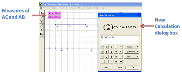
  10. To find the value of m, we divide AC by AB, multiply the result to 20 and the subtract 10. To do this, click the Measure menu and click Calculate from the list.
  11. Click the text on the drawing area displaying the measure of AC, click the ÷ button from the New Calculation dialog box, click the label displaying the measure of AB, click * from the New Calculation dialog box, then type 20-10, then click the OK button on the dialog box when finished.  This will be our value of m.
  12. Figure 4 – The New Calculation dialog box.

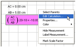
  13. Move point C and observe what happens to the value of m. If you want to Edit your calculation, just click the Arrow tool, right click the the value of m, then click Edit Calculation.
  14. Figure 5 – The pop-up menu that appears when you right click the value of m.

  15. To graph y = mx, click the Graph menu, then click Plot New Function to display the Plot New Function dialog box.
  16. While the Plot New Function box is displayed, click the label containing the value of m, click the * button, click the x (or type x), then click the OK button. If you have followed the steps correcty, the graph of y = mx should appear in your coordinate system.
  17. Hide points A and B and the labels containing the values of AB and AC by clicking the Display menu and click Hide Objects.
  18. Move point C. What do you observe? What relationship can you conclude between the value of m and the appearance of the graph of the function?

Exercise:

  1. Construct another slider for the value of b.
  2. Construct a graph that will display the value of f(x) = mx + b.
  3. Describe the effect of b in the graph of the function f(x) = mx + b.

Plotting with Ivan Johansen’s Graph Software

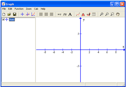
Graph, a graphing software created by Ivan Johansen, was the first graphing software I have learned to use. Although the graphics quality is not that impressive, it has some features that are not available in other graphing software, the most notable of which is the polynomial of best-fit.

Figure 1 – The Graph Window.

The tutorial below teaches the basics of Graph, and most examples are related to elementary and high school mathematics.

The basic capabilities of Graph are enumerated below.

I. Graph Functions

As an example, we will plot the graph of the function f(x) = x2 + 3x from x = -3 to x = 2, the graph of which is shown in Figure 2.

  • To graph a our function, just click the Function menu from the menu bar, then click Insert function, then type the equation of your function. The enumerated steps below are associated with the numbers shown in Figure 2.
  1. Choose Standard from the Function type drop-down list box.  The other options are Parametric and Polar.
  2. Type the equation of our function f(x) = = x^2 + 3x in the Function equation text box. Like other software, Graph uses ^ to denote exponential notation.
  3. Specify the domain of the function which is from -3 to 2.
  4. Choose the type of start and endpoint at the Endpoints drop-down list boxes. We choose circle for our left end point and arrow for our right endpoint.
  5. Change the color, line style, draw type, and width of the graph. Click the OK button when you are done.

Figure 2 – The Function dialog box and the graph of the function f(x) = x2 + 3x.

Exercise: Refer to the steps above in graphing the following functions:

Standard Functions

  1. f(x) = x^3 + 3x – 1
  2. f(x) = sin(x)
  3. f(x) = sqrt(x)
  4. x(t) = cos(t), y(t) = tan(t)
  5. e^(sin(t)) – 2cos(4t) + sin((t – pi/2) /12)^5

Note: a, b and c are standard functions; d is parametric and e is polar. Choose their appropriate function type the Function type box before typing the equations.

II. Graph Inequalities

To get the intersection of the graph y < x^3 + 3 and y > 2x, we first transform the inequality to equation, and choose the shaded portion later. This is the part of Graph that I do not quite like. It’s more like manual drawing rather than graphing.

  1. Click the Function menu from the menu bar, the click Insert Function.
  2. Type x^3 + 1 in Function equation box.  
  3. To graph y > 2x, repeat step a and type y = 2x in the Function equation box.
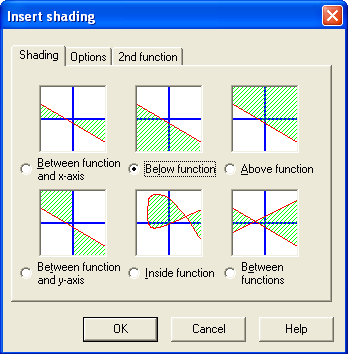
  4. To shade the graph below x3 + 3, be sure that the equation of the function is selected in the equation window (left pane). Click Function from the menu bar and then click Insert shading… from the list.
  5. Choose Below function icon (see Figure 3). Take note of the other options. Click the OK button.
  6. As an exercise, shade y > 2x.

Figure 3 – The Insert Shading dialog box.

III. Plot Points Series and Determine Line (or Polynomial) of Best Fit

To plot a point series, click the Function menu from the menu bar, click Insert point series. Type the ordered pairs on the Insert point series window as shown below.

Figure 4 – The Insert Points series dialog box.

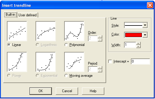
To insert a line of best fit, click the Function menu from the menu bar, then click Insert trendline….  In the Insert trendline window, choose Linear. Notice that you can also choose polynomial of a chosen order fit.

Figure 5 – The Trendline dialog box.

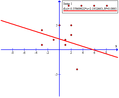
Change the Line width to 3 and click the OK button. The line of best fit of our point series is shown below. The line of best fit graph is shown in Figure 6.

Figure 6 – The Line of Best Fit of the given data in Figure 4.

IV. Find the area under a curve

Graph is capable of finding the area under a curve or technically, perform definite integration. In the example below, we will find the area under the curve of y = sin(x) from -2 to 3.

  1. To plot y = sin(x), click the Function menu from the menu bar and click Insert function from the drop-down list box.
  2. Type sin(x) in the Function equation box.
  3. To get the area of the curve under -2 through 3, click the Calc menu from the menu bar, then click Area from the list.
  4. A dialog box will appear located at the bottom-left of the Graph window. Type -2 in the From text box and type 3 in the To text box. Notice that the area the curve is displayed on the Area box below the To text box.

V. Generate a table from a graph

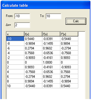
Graph is capable of generating table from a graph. If we want to generate table of values of the graph y = sin(x) in (4), be sure that the graph is selected in the left pane of the Graph window, then do the following steps:

  1. Click the Calc menu and then click Table.
  2. Type the minimum value, say -10, in the From text box and the maximum value, say 10, in the To text box.
  3. In the \delta x text box, type the interval, say 2, of your table, the click the Calc button.

Figure 7 – The data generated from graph y = sin(x).

Notice that not only the x and f(x) are displayed but also the value of the first and second derivatives.

Graphs, Equations and Tables in Microsoft Excel

Introduction

We can represent functions in three ways*: graphs, tables (or list) and equations.  It is often better to view simultaneously the representations of a function to be able to understand its behavior, but it is quite hard – or expensive – to find a software with such functionality.  However, with some knowledge on formulas in MS Excel, it can actually be done.

In this tutorial, we are going to represent functions of the form y = mx + b by letting the user enter and change the values of m and b, then generate the equation, the table, and the graph at the same time. Although we are going to use Microsoft Excel 2007 in this tutorial, but this can be done using lower versions. The expected output of this tutorial can be downloaded here.

The prerequisite of this tutorial is basic knowledge of Microsoft Excel, but I designed this tutorial to be stand-alone, so inexperienced Excel users could follow it step by step.

Preliminaries

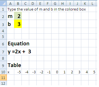
The first thing that we are going to do is to place the letters m in A2 and b in A3.  A2 and A3 are examples of cell addresses.

As you can observe, a worksheet is composed of columns labeled with letters and rows labeled with numbers.  The intersection of a column and a row is called a cell and its location is determined by its cell address which is its corresponding column letter and row number.

Setting up for user input boxes

  1. To place the instruction, click cell A1, then type Type m and b in the colored boxes: Note that when you click a cell, the cell pointer appears. The cell pointer is the rectangular box where your text appears when you type in the worksheet.
  2. Type m in cell A2 and type b in cell A3.
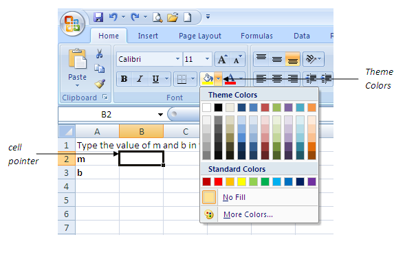
  3. Place the cell pointer in B2, and choose the color you want from the theme color box(see Figure below). Using the Theme color box, change also the color of B3. You may want to change the font of the text you have written should you want.

Figure 1 – Theme Colors dialog box

Generating the Equation

We want the equation y = mx + b to appear when the user put the value of m in B2 and the value of b in B3. To do this, we will use the concatenate command. The concatenate command joins series of strings (characters, words or numbers). In our case, we will join the string  “y =”, the content of B2 (which is our m), the string “x +” and the content of B3.  We will put our equation in B7 so that we can put our graph on the right side of our worksheet. The logic is that we want the equation to appear like y = content of B2 x + content of B3, where the content of B2 is the number typed by the user in cell B2 and the content of B3 is the number typed by the user in B3. Notice that the different colors indicate the string groups.

  1. Type 3 in B2 and 5 in B3. This will enable us to see later if our concatenate command will work.
  2. Type Equation in A6.
  3. Place the cell pointer in A7. Type =CONCATENATE(“y =”, B2,”x +  “, B3). Then press the ENTER key on your keyboard.

Notes on the concatenate command:

  1. Words concatenated are separated by commas.
  2. Texts are enclosed by quotations(such as “y =”)
  3. Values of cells are distinguished by their address. For example, B2 means that it will display the content of cell B2 which is 3.
  4. If you want to edit the equation, you can double click the cell or press the F2 function key on your keyboard.

Generating the Table

In this section, we will display the values of the x– from -5 to 5 from B10 all the way to L10 and compute for its corresponding y-values. from B11 to L11.

  1. Type Table in cell A9 and type x in cell A10 and y in cell A11.
  2. Next, we adjust the width of the cells containing the table. Highight A10B10. In the Home tab of the Excel toolbar, click Format from the Cells block, then click Column width.

    Figure 2 – The Format Column Width command

  3. In the column width dialog box, type 3, then press the OK button.
  4. Type the -5 in B10, -4 in C10, and so on all the way to 5 in L10. Your table should look like the table below.

Figure 3 – Values of x

Finding the values of y

Next, we want to get the corresponding values of y in the equation y = mx + b. To do this, we  multiply the value of m (located in B2) to the value of x (located in B10) then add it to  the value in b (located in B3).  Our expression should be, B2*B10 + B3. In Microsoft Excel, formulas always start with an equal sign. So we will type type =B2*B10 + B3.

  1. To compute for the value of y in B11, click cell B11, then type =B2*B10 + B3 then press the ENTER key.
  2. We can type one-by-one the other corresponding values of y but we can do better than that. We will just copy the values of cell B11 to C11 all the way through cell L11 to get the other y-values. But before that, we must modify the formula written in B11. We should edit that formula in B11 and change it to =$B$2*B10+$B$3. Notice that we add dollar signs in B2 and B3. For the explanation of this see ** below.
  3. To Edit the formula in B10, double click cell B11 (or click cell B10, then press the F2 function key on your keyboard), then change the formula to =$B$2*B10+$B$3
  4. Next we copy the formula in B11 and paste it from C11 all the way to L11. To do this, place the cell pointer in B11, then click the Copy icon from the toolbar (or press CTRL  C).
  5. Highlight C11 to L11, then click the Paste icon from the toolbar (or press CTRL V)
  6. If you have done the procedures correctly, and have not changed the values of x and y you inputted earlier, your table should look like the diagram below.

Figure 4 – Table of values of the equation y = 3x + 5

Q1: Change the values of m and b in cells B2 and B3. What do you observe?

Constructing the Graph

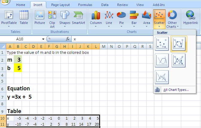
    1. To create the graph, highlight the table from B10 to L11 as shown below

    1. In the Charts section of the Insert tab of the Excel, click Scatter and choose the graph on the second graph in the first row. A graph should appear on your worksheet.

  1. Try to change the value of m and b several times. What do you observe about the graph?

Formatting the Graph

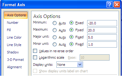
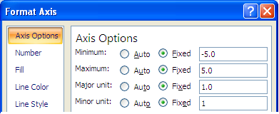
If you can observe, the axes of the graph automatically adjust to the value of m and b. Entering the bigger values of m also increases the range of the y-axes. To remedy this problem, we must set the axes to constant range regardless of the values of m and b. We will set the range of the y-axis from – 20 to 20, and the range of the x-axis from -5 to 5.

Setting the Axis Range

    1. To set the domain and range of the graph of the y-axes, click the y-axis and be sure that a rectangular box appears as shown below.

Figure 7 – The y-axes selected

    1. Right-click the rectangular box surrounding the y-axis, then click Format Axis from the pop-up menu.
    2. In the Axis Options, select all the Fixed option button, then copy the numbers shown below.

    1. Click the Close button.
    2. Now, adjust the Axis options of the x-axis by right-clicking the x-axis and choosing Format Axis. Copy the numbers as shown below.

Figure 9 – Axis options for the x-axis

  1. Click the Close button.
  2. Change the values of m and b. What do you observe about the equation, the table and the graph?

Q2: How does the value of m and b affect the graph?

_____________________________________________________________

*Actually, functions can also be represented verbally, so that makes the number of representations 4.

** When you copy formulas in Excel, the locations of cells also adjusts.  For example, if I copy the formula in B11, which is =B2*B10 + B3, to C11 that is one cell to the right – all the cell addresses in the formula will also adjust one cell to the right. If you do that, the formula in C11 will be =C2*C10+C3 where C2 is now our m and C3 our bwhich is different from their original locations. The dollar sign tells Microsoft Excel to points to a constant location – in our case, B2 and B3.